Designing the Perfect Wedding Invitations
Wedding Invitations: They’re More Than Just a Piece of Paper!
Hey there! As someone who’s currently planning their wedding, I can tell you that the process is exciting, stressful, and at times, overwhelming. But one thing that I’ve learned is that wedding invitations are more than just a piece of paper that you send out to your guests. They’re the first glimpse into your big day and can set the tone for everything from the dress code to the decor. So, it’s important to give your wedding invitations the attention they deserve and ensure they’re sending the right message.
Choosing Colors That Match Your Wedding Theme
One of the most exciting aspects of designing your wedding invitations is picking the perfect color palette. To start, consider the overall theme of your wedding. Do you want a classic and elegant feel or something more modern and whimsical? Once you have determined the vibe of your wedding, choose two to three main colors that fit your chosen theme. Be sure to consider how these colors will look when printed on the paper you choose for your invitations.
Don’t be afraid to get creative with your color choices – consider using metallic accents or a bold pop of color to make your invitations stand out. However, if you’re not confident in your color choices, it’s always safe to stick with a classic and neutral palette.
Remember that the colors you choose for your invitation will set the tone for your wedding day, so be sure to choose something that reflects your personality and the style of your event.
Choosing the Perfect Paper: Don’t Skimp on Quality
When it comes to choosing the paper for your wedding invitations, don’t be fooled into thinking that any old cardstock will do. The type of paper you choose can make a huge difference in the overall look and feel of your invitations. Here are a few things to consider:
Types of Paper
There are several different types of paper to choose from, each with its own unique characteristics:
The weight of your paper can also affect the look and feel of your invitations. A heavier weight paper will feel more substantial and luxurious, while a lighter weight might come across as cheap or flimsy. It’s important to strike a balance between weight and cost, so choose the heaviest option that fits within your budget.
Color
The color of your paper can complement or contrast with your chosen color palette. Neutral colors like white or ivory work well with most themes, while pastels can add a soft and romantic touch. If you’re feeling bold, you might even try a bright or metallic color to really make your invitations stand out.
Ultimately, the choice of paper will depend on your personal preferences and the overall look and feel you’re going for. Don’t be afraid to experiment with different options until you find the perfect fit for your wedding invitations.
Incorporate meaningful elements: Adding a Unique Touch to Your Invitations
When it comes to wedding invitations, you want to create something memorable that reflects you and your partner. One great way to do this is by incorporating meaningful elements that are special to you both. Maybe it’s a favorite quote, a special symbol or logo, or even a beloved pet included in the design. Adding these unique touches can make your invitations stand out and be a true representation of your love story.Don’t be afraid to get creative with your ideas. For instance, consider using a map of the city where you met or including your favorite song lyrics in the design. If you’re a nature lover, add some flowers or greenery to the invitations. If you’re both avid travelers, incorporate images of different landmarks from around the world. Anything that has significance to you can be transformed into a meaningful element for your invitation design.Adding these personal touches is also a great way to make your guests feel connected to your special day. They’ll appreciate seeing the thought and care that went into the invitations and will have a deeper understanding of what makes your love story unique. So, think about what’s most important to you and your partner, and how you can bring those elements into your wedding invitation design.
Get Creative with Fonts
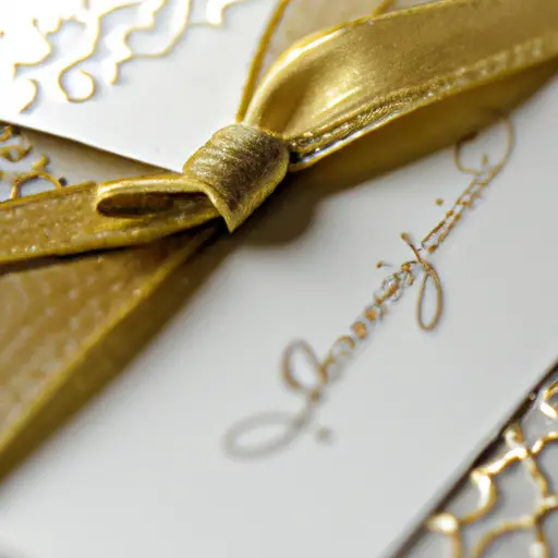
Hey y’all! Let’s talk about fonts for your wedding invitations. This is one of the best ways to personalize your wedding invitations and make them stand out from the rest. First things first, think about your theme and mood. A whimsical and playful wedding might benefit from a script font, while a more traditional and formal wedding could use a classic serif font.But don’t stop there! Some experts recommend using multiple fonts on your invitation to add visual interest. Just make sure they complement each other and aren’t too overwhelming. Also, consider the size of your font. The information should be easy to read, so make sure any decorative fonts are still legible.Another fun idea is to use custom-designed calligraphy. This is a great way to add a unique touch to your invitations and make them truly one-of-a-kind. Some designers even offer custom monograms, which can be incorporated throughout your wedding stationery suite.Lastly, don’t forget about color. Consider using a metallic or shiny font to add a touch of glamour to your invitations. Overall, don’t be afraid to get creative with fonts and make your wedding invitations truly your own!
Make Your Information Legible!
Okay, so you’ve picked your colors, the right paper, and have even included meaningful elements to your wedding invitation. But have you made sure that all the information on your invitation is legible? It’s easy to get caught up in the aesthetics of an invitation, but it’s equally important to ensure that your guests can easily read and understand all the necessary details.
First and foremost, make sure that the font you choose is easy to read. This means avoiding overly decorative or fancy fonts that may look pretty but can be difficult to read. Stick to clear, simple fonts that are easy on the eyes. Additionally, make sure that the size of the font is big enough to be legible – it’s worth testing out the font size on a sample print of your invitation to see if it’s readable from a comfortable distance.
When choosing the layout of your invitation, consider the placement of each piece of information. It’s best to use a hierarchy of information, with the most important details (like the names of the couple and the date and time of the wedding) in a larger font and prominent position, followed by additional details (like the location of the wedding and reception) in a slightly smaller font size and lesser prominence.
Lastly, double-check your invitation for any typos or errors. Having a second set of eyes (like a trusted friend or family member) can be helpful in catching any mistakes that you might have missed.
Remember, your wedding invitation is more than just a pretty piece of paper – it’s a way to communicate important information to your guests. By making sure that all the details are legible and easy to understand, you can ensure that your guests will have a great time celebrating with you on your special day!
Add a Personal Touch
A wedding invitation is a reflection of the couple’s personality. That’s why it’s crucial to add a personal touch to your wedding invitations to make them unique and memorable. It can be as simple as adding a couple’s photo or a creative element that represents your relationship. For example, if you and your partner met in Paris, you can add an Eiffel Tower image to your invitation suite. Or if you’re having a rustic wedding, you can include a miniature wooden tag with the bride and groom’s initials tied with twine. Whatever you choose to add, make sure that it fits the overall theme of your wedding.
If you’re struggling to come up with ideas, turn to Pinterest or Instagram for inspiration. Browse through different wedding invitation designs and pick elements that resonate with you. You can also brainstorm with your partner or bounce ideas off of your wedding planner. Just remember, the personal touch doesn’t have to be expensive or time-consuming. It’s the thought that counts.
If you want to take the personalization to the next level, consider using calligraphy or hand-lettering for the invitation. This will add a personal touch that will impress your guests. Hiring a calligrapher might seem like an added expense, but it will give your wedding invitations an elevated feel.
Remember, the goal is to create a wedding invitation that reflects who you are as a couple. It’s an opportunity to showcase your unique love story, so don’t be afraid to get creative!
For more helpful tips on selecting the ideal wedding invitation, check out Love Laughter Happily Ever After.
Don’t Forget to RSVP!
Okay, listen up folks. This might seem obvious, but you’d be surprised how many couples forget to include an RSVP card with their wedding invitation. Don’t be that couple. Including an RSVP card is crucial to getting an accurate headcount for your big day.
When designing your RSVP card, keep things simple. Make sure to include the names of the invited guests, a space for them to indicate whether or not they will be attending, and a deadline for them to respond by. You can also include meal options, song requests, or any other pertinent information you want to gather from your guests.
Remember, it’s important to make it easy for your guests to RSVP. You can provide a stamped and addressed envelope for them to send back their response or you can offer an online option for them to RSVP through your wedding website. Whatever method you choose, make sure it’s clear and easy to understand.
One final thing to keep in mind – don’t forget to keep track of your RSVPs! You don’t want to be caught off guard by unexpected guests or a lack of responses. Consider using a spreadsheet or wedding planning app to keep everything organized.
9. Use decorative envelopes to jazz up your invitations!
Alright, it’s time to talk envelopes. I’m sure you’re thinking, “Why do I need to worry about the envelope? It’s just going to get thrown away anyway.” Well, let me tell you, friend, the envelope is the first thing your guests will see when they receive your invite. It sets the tone for what’s inside and gets them excited for your big day.So, how do you choose the perfect envelope? First, consider your color palette and theme. You want your envelope to match the overall look of your invitation. If you’re going for a rustic feel, a kraft paper envelope would be a great choice. If you’re going for something more elegant, a metallic or vellum envelope would be stunning.Next, think about the size and shape of your invitation. You want an envelope that fits your invite perfectly, without any awkward gaps or bulges. You also want to make sure your envelope is sturdy enough to protect your invitation during mailing.Now, let’s talk about the fun stuff – decorations! You can choose from a variety of envelope embellishments to add some extra flair. Try adding a wax seal, a ribbon, or a custom stamp. You can even handwrite your guests’ names and addresses for a personal touch.Just remember, don’t go overboard with the decorations. You still want your guests to be able to easily open the envelope and access your invitation. But with a little creativity, your envelope can truly make your invitation stand out.
Check Your Invites Twice: The Importance of Reviewing Before Sending
Hey there, fellow lovebirds!
I’m here to remind you not to overlook the most crucial step of the wedding invitation process- reviewing them before sending them out into the world.
Typos, incorrect information, or poor design can cause major problems and confusion for your guests. To avoid any mishaps, block off some time to carefully review each and every detail.
What to Review
The first thing to check is your wording- make sure all names, dates, times, and venues are correct. It may seem like a no-brainer, but double-checking is essential. Next, proofread for grammar and spelling errors. This is where a fresh pair of eyes can come in handy- ask a friend or family member to review it as well.
Once you’re confident that the content is perfect, take a look at the design. Is it visually appealing and easy to read? Is it cohesive with your wedding theme and color palette? Ensure your fonts, spacing, and image placement are consistent throughout.
When to Review
Don’t leave it to the last minute! Begin reviewing and making edits at least a week before your intended mail-out date. This will give you enough time to make any necessary changes and order additional prints if needed.
And once you’ve made your final review, take a deep breath and hit send! Your guests will appreciate the attention to detail and effort that went into their invitation.
So let’s raise a glass (or should I say, a pen), to ensuring your invitations are flawless and unforgettable. Cheers!
